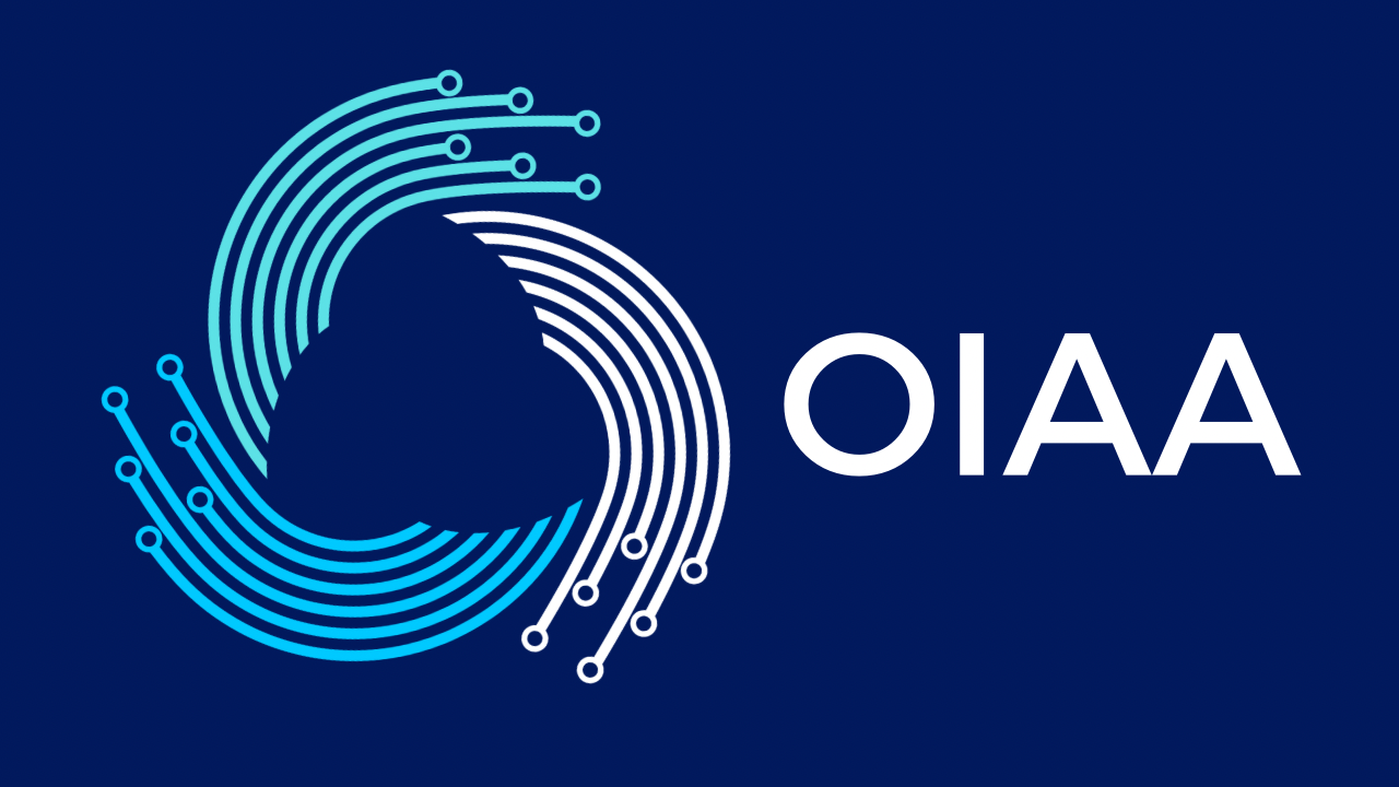
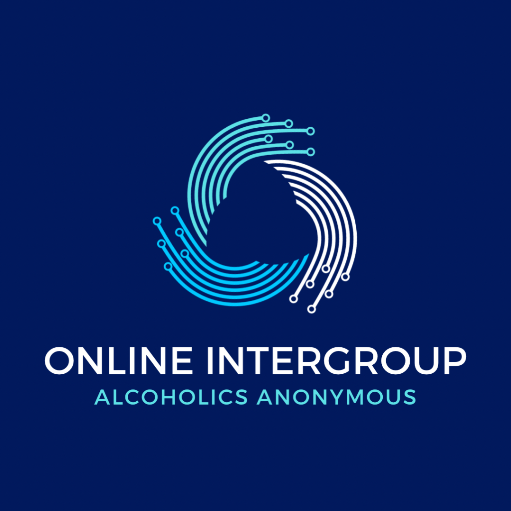
New OIAA Logo
With over 400 votes cast by OIAA members we are very excited to unveil the new OIAA Logo, designed by Deb W!!
We asked Deb to share a few words about what went into her design process. Here’s what she shared with us:
In a nutshell:
I like threes—both in ad copy and design!
Body, mind, spirit. Pause, pray, proceed. The AA triangle. Three is powerful representation of unity. I use the Rule of Three in my copywriting—a lot, a lot, a lot!
And in three words, my goal for the OIAA logo was to keep it 1) simple; 2) memorable; and 3) reproducible.
As an ad writer (not a design pro) my visual muse is Canva—an online design and publishing tool. Using Canva, I did an image search for: technology, planet, digital, communication, etc. The icon I ultimately chose simply revealed itself in magical THREES! The arched and dot-tipped lines form a circle, representing “the world” and “digital tech” in 3 hues of blue/green. The colors reminded me that Big Book blue and Twelve & Twelve blue don’t match. There doesn’t seem to be a standard AA blue, which I find interesting as a branding gal.
I wish I could take credit for hours of head-scratching, creative toil, and baskets full of “that’s not quite right” before the logo emerged. But that’s just it. It revealed itself. Kinda reminds me of what my Higher Power does (with a God wink) when I’m ready!
A tremendous expression of gratitude to all the contributors and participants for making this a fun and rewarding process!
What an amazing display of creativity and talent offered from everyone! Thank you!!
We look forward to incorporating the logo into the website and other OIAA related materials and documents very soon!